Recipe View
The Recipe View renders a recipe note as an interactive card instead of plain Markdown - ingredients you can scale and add to your grocery list, steps with built-in timers, and at-a-glance info about diet, time, and nutrition.
Recipe Box is optimized for both mobile and desktop.
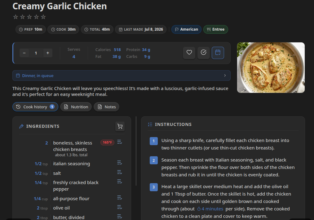
Opening the Recipe View
If Auto-open recipe view is enabled (default), any note that qualifies as a recipe (see Getting Started) opens in the recipe view automatically.
You can switch a note between views manually with the Open as recipe and Open as Markdown commands, or the corresponding icon in the view header.
Header
- Title - the note's title, with a star rating widget if you've set a
ratingvalue. - Tags (optional) - the note's frontmatter tags, shown above the badge row if Show tags in header is enabled.
- Badges - by default: diet tags (from
diet), prep/cook/total time, and a "last made" indicator when present. The badge row is fully configurable - see Customizing the Recipe Header. - Allergen warning - if any of the recipe's
allergensmatch your My allergens setting, a warning banner appears. - Favorite toggle - star icon that sets/unsets the
favoritefrontmatter property. - Add/remove meal plan button - adds or removes this recipe from your meal plan. Opens the Add to meal plan dialog when adding.
- Mark as cooked button (if Show mark as cooked button is enabled) - opens a dialog to record the date, optional notes, and an optional photo for this cook. Stamps
lastMade, incrementscookedCount, and appends a new entry to thecookHistoryarray in frontmatter. See Cook History. - Cook mode toggle (sun icon) - activates the Screen Wake Lock API to keep your device screen on while you cook. Tap the icon again to turn it off. An indicator appears in the tab header while cook mode is active.
- Export button - opens the export dialog to save or download the recipe in a variety of formats. See Recipe Export.
Layout: Desktop vs. Mobile
Desktop defaults to a two-column layout: the hero image, ingredient list, and recipe info fill the left column; instructions fill the right. A draggable divider between the columns lets you resize the split. You can switch to the classic single-column layout (ingredients above instructions, full width) under Settings → Recipe Box → Recipe view → Desktop recipe layout. The two-column split resets to 50/50 on demand via the Reset two-column split button in the same section.
Both columns are "sticky" so that when scrolling long instructions, your ingredients list stays in view. And vice-versa.
Mobile uses a tabbed layout with swipe navigation between tabs:
- Ingredients - the ingredient list and multiplier
- Steps - the instruction list with timers
- Info - servings, nutrition, times, diet, allergens, and the source link
- Cook History (shown when Track cook history is enabled) - a full, scrollable log of every time you've cooked this recipe, with dates, notes, and photos. Swipe to this tab or tap its clock icon.
Swipe left or right anywhere in the content area to move between tabs. Swipe slowly or vertically to scroll normally without switching tabs.
The Image Card
The hero image is resolved from the image frontmatter property, which can be a vault-relative path or a URL. If an image property is not found or is empty, the first image in the recipe note will be used. If no image is found, a placeholder image is shown instead.
Multiplier (Scaling a Recipe)
A +/- stepper (in increments of 0.5) lets you scale the recipe up or down. Changing it:
- Writes the new value to the
multiplierfrontmatter property, so the scale persists. - Recalculates every ingredient quantity shown in the recipe view.
- Recalculates nutrition and servings figures shown in the info section.
Quantities added to the grocery list reflect the current multiplier.
Servings and Nutrition
The servings and nutrition cells (calories, protein, fat, carbs) can display either per-serving or total values, controlled by Nutrition display. Whether the values stored in frontmatter represent the recipe total or a single serving is controlled separately by Nutrition source - Recipe Box converts between the two as needed. See Settings Reference for both settings.
Ingredient List
Each ingredient line shows its (scaled) quantity, unit, and name, plus:
- Meat temperature badge - if Show meat temperature warnings is enabled and the ingredient is recognized as a meat, fish, or shellfish, Recipe Box shows the USDA-recommended safe minimum internal temperature. See Health and Safety Warnings.
- High-GI badge - if Diabetic mode is enabled and the ingredient matches your glycemic-index dictionary, a high-GI badge is shown.
- Add to grocery / remove from grocery icon - lets you add or remove that single ingredient from the grocery list independent of the meal plan.
Lines tagged #IgnoreIngredient are shown in the recipe but excluded from grocery list generation.
Instructions
Steps are shown as a numbered list, grouped under any subheadings used in the note. If Enable timers is on, Recipe Box detects duration phrases (e.g. "simmer for 10 minutes") and renders them as clickable timer buttons - see Recipe Timers.
Cook History Tab (Mobile)
On mobile, the Cook History tab shows the full history of this recipe inline - no modal required. Each entry shows the date, your notes if any, and the photo if one was taken. Tap the pencil icon to edit an entry or the trash icon to delete it. Scrolling through a long history works naturally within the tab.
To add a new cook history entry, use the Mark as cooked button in the recipe header - it's always visible and is the intended entry point.
Related Settings
Most recipe view behavior is controlled from Settings → Recipe Box → Recipe view, Recipe library, Nutrition, Cooking & tracking, and Health & safety. See Settings Reference for the full list.